RePot (later ReGrow) is a Danish company founded in 2020 that was at the in the startup phase and has evolved from a dedicated school project that shows great and needed ideas and potential. Their goal is to sell 100% biodegradable plant pots. However, this is only a small part of the bigger picture. The company focuses on a very important issue, which is acting for sustainable development. The 3 founders of the Repot hope to create a larger group of community who will want to actively fight the negative changes in our climate.
They were in the testing phase and were getting ready to enter the market with their product. Given the early stage of the startup, it was a great time for us to ensure a strong brand presence and to make the brand visible. The company needs an effective website supported by social media and well prepared marketing strategy, which will ensure visibility among the target groups and thus create a bond with future clients, which will ensure the possibility of creating a community and a successful start in the industry.
Project type: Group project My Role: In this project I was a team leader and participated in every stage of the project, i.e. Company Analysis, UX Researcher, Wireframes, UI/UX Designer, Usability Testing Project Duration: 5 weeks Used Tools: Ai, Ps, Adobe XD Team members: Virág Vajay, Ida Skjødt Olesen Gergő Deés, Sylwia Misiak
Problem statement:How can our team rethink Repot’s visual and digital presence and build a community around environmental causes?
Project Goals
1. Digital Solution A classic presence as a website helps to market your brand online and grant reliability with the possible future partners in connection with your business. In case of a website, the customers need to be able to find an organized platform to collect all the needed contact and location information as well as details about the business and its activity. We wanted to represent the above mentioned elements in case of ReGrow.
2. Visual Identity There are multiple components that are important to include when creating a visual identity, here among: logo, colors, fonts, icons, illustrations, images, communication, ToV and website. The visual identity of a company should be based on the characteristics of the company, and their values and product, but research about the target group(s) is also very relevant.
3. Community The problem of sustainable development is more often raised not only in the news media, but also by individual industries and companies. The community is becoming more and more aware of the possible consequences of bad development, which is why it is so important for us to help ReGrow create a community that will spread the values that are important to them. In addition, being a part of a community can make us feel as though we are a part of something greater than ourselves. It can give us opportunities to connect with people, to reach for our goals, and makes us feel safe and secure.
Design Process
Research
Company and target group analysis. Gain user insights and understand the challenge.
Ideation
Deciding on content, sitemap, creating sketches.
Design
Creating moodboard, styletile, wireframes, mockups and prototype.
Testing
Get user feedback and draw conclusions.
Research
Company analysis
To better understand the company and discover its needs, goals and challenges, we have conducted an in-depth analysis that will lead us to create an appropriate brand purpose.
BMC The main thing we highlighted is the mindset of the RePot team: they want to bring a brighter future to the humankind, build community around sustainability and share knowledge. They also want to convey their inspiring approach throughout their eco-friendly product.
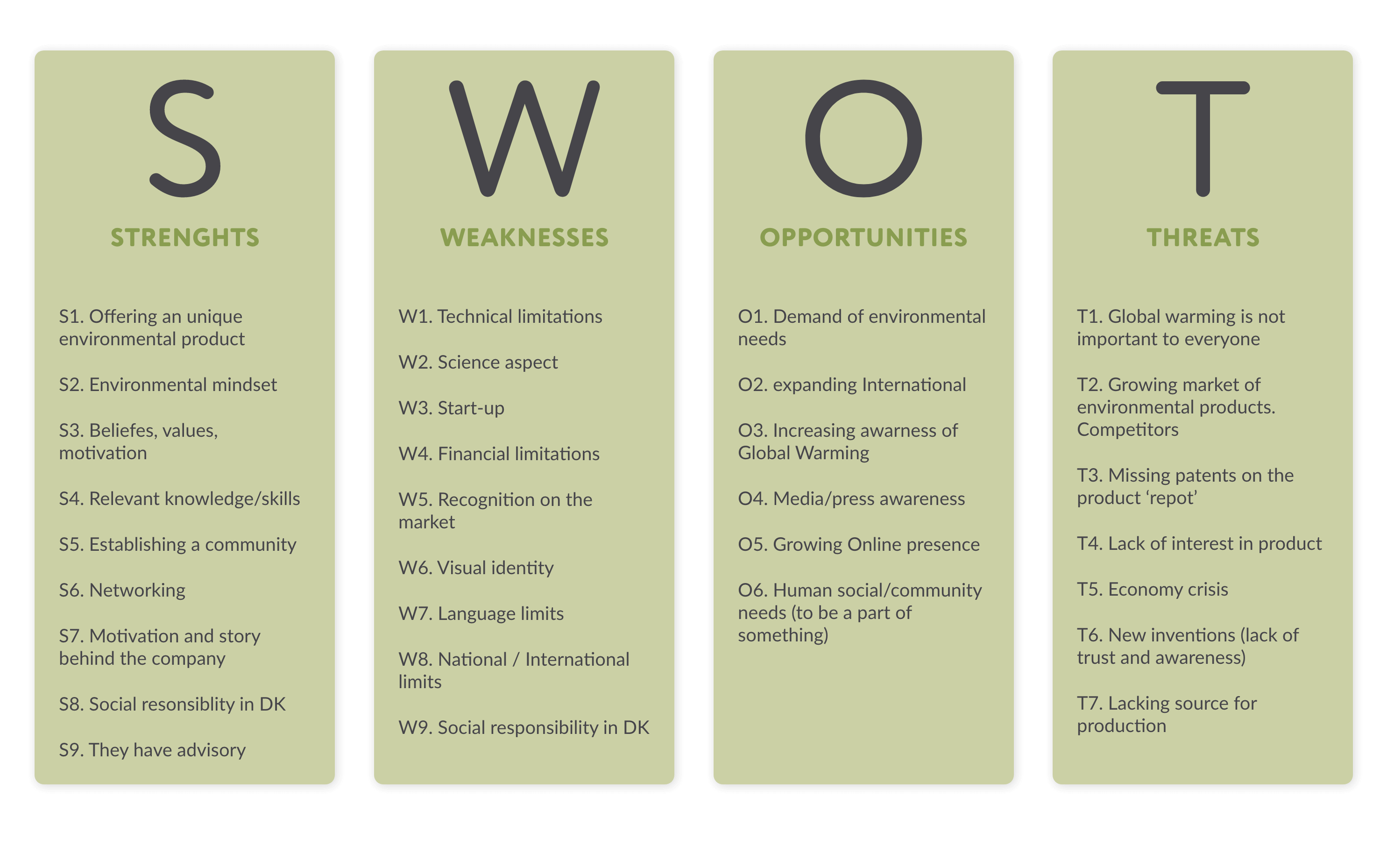
SWOT As the protection of the environment is a highly focused topic these days, we listed their conscious and environmental mindset to their strengths as well as their commitment to their country. We realized they also have a lot of opportunity in relation to the growing interest about the climate crisis and global warming. We also found some internal weaknesses in relation to them being a start-up company so don’t have any market recognition and lastly found their threats in the fact that there are competitors with similar products. We also needed to take into consideration that plastic pollution does not cover the interest of everyone.
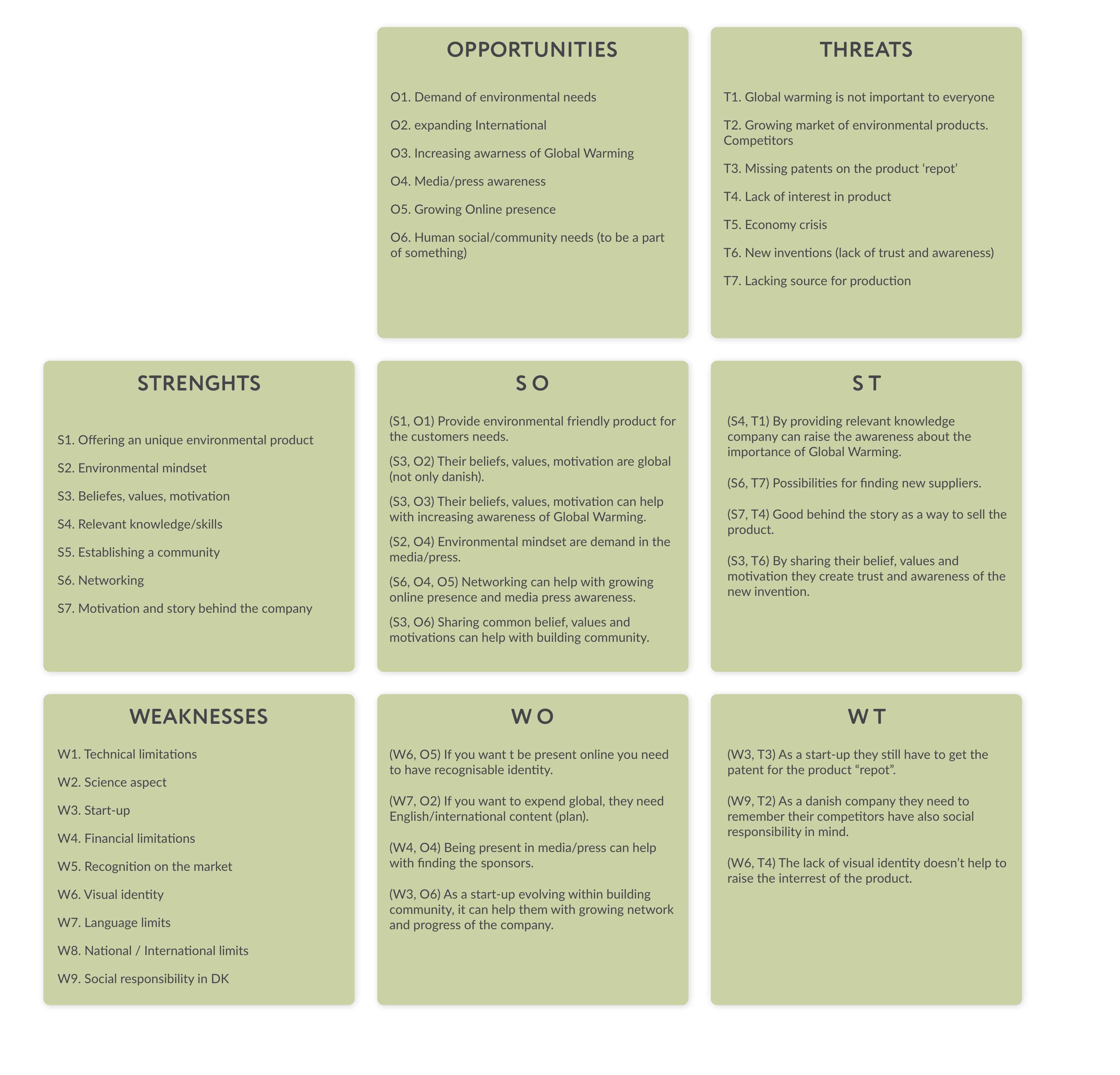
TOWS We created action ideas by linking together both internal and external factors, to implement creative opportunities and minimize threats. As you can see below, with the help of TOWS analysis we got numerous ideas, and a clearer vision about the possible future content. We wanted to focus on fulfilling the increasing demand of social responsibility connected with their possible growth as a community. Also found a good opportunity in SoMe presence as it is a perfect spot to find new investors and build a valuable network. The fact that Annika has a strong horticultural background by her family, shows that her idea is based on a real life problematic experience that she wanted to solve. This gave an authentic background story to the whole brand.
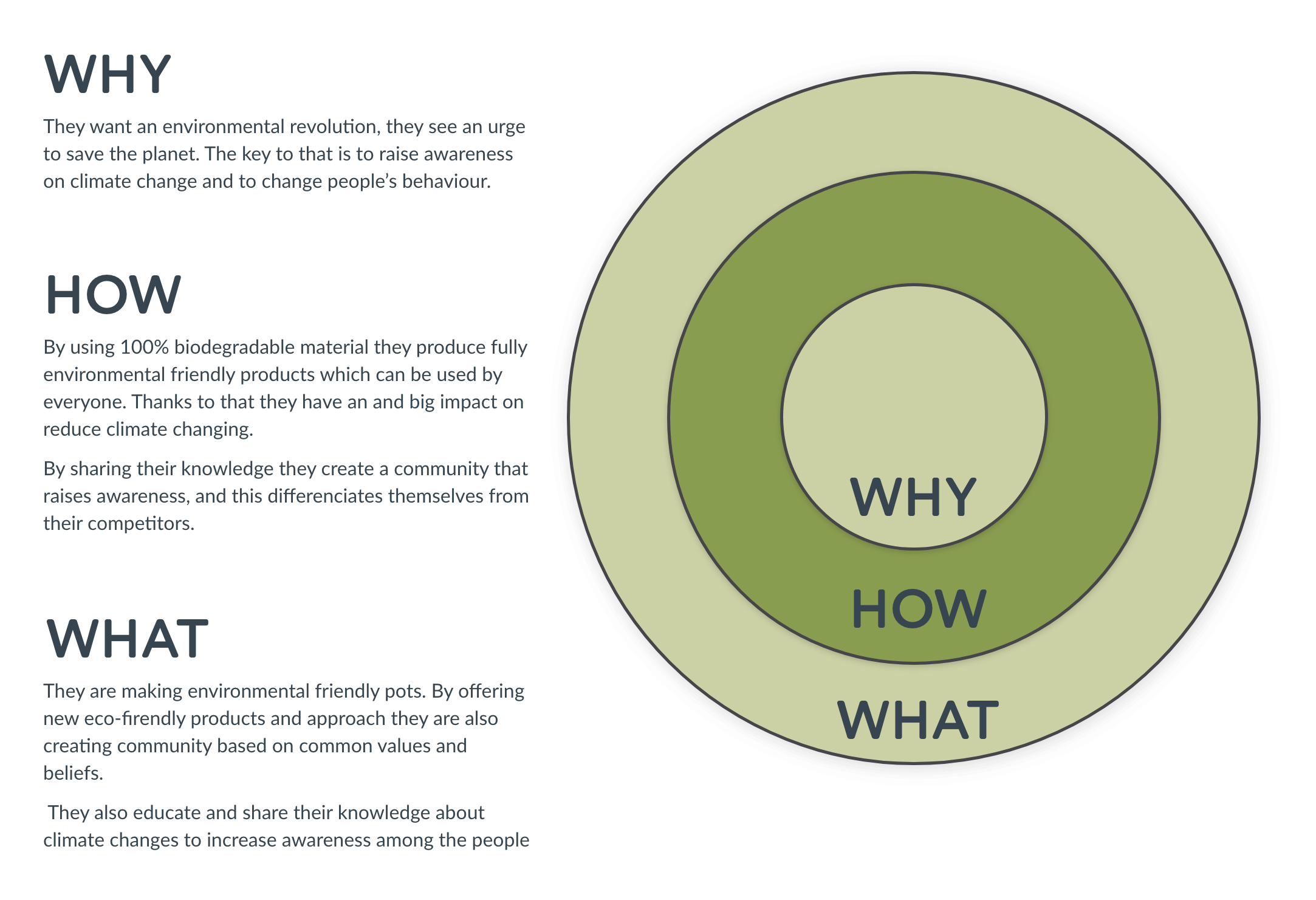
Golden Circle Simon Sinek in his book Start with WHY introduces the concept known as the Golden Circle. He argues that this inside- out approach, from Why and How to What, has the greatest impact and promises long-term success.
In the graphic below we have presented an analysis of the Golden Circle for the RePot company, whose main ring is undeniably WHY. The Why is basically the beginning of everything for the Repot. Inspired by scientific research and people like David Attenborough, Repot decided to take a fight. They want an environmental revolution. They see an urge to save the planet. Now, there is no later anymore. The key to that is to raise awareness on climate change and to change people’s behavior.
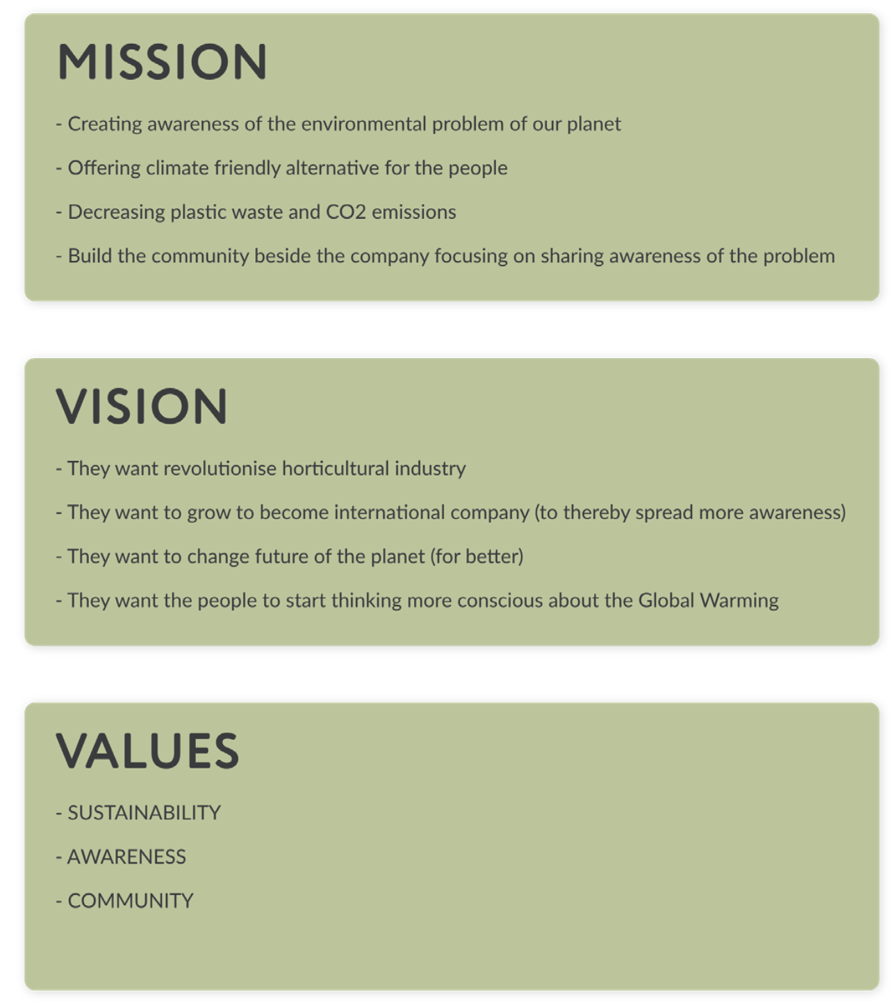
Brand’s mission, vision and values Clarifying a brand’s mission, vision and values must be done in order to fully understand what they stand for. They underline their goals and purpose. Our brand revolves around sustainability, which is something that is reflected in both their mission and vision. Their mission includes creating awareness of the environmental problems of our planet, decreasing plastic waste and CO2 emissions, building and educating a community focusing on climate change – all while offering a climate friendly alternative for the people.
They vision a greener future. A revolutionised horticultural industry, as an international company (to spread awareness). A changed, better future filled with people who actively make conscious choices about climate change. Their three main values are sustainability, awareness and community. It is clear they focus on the things that will ultimately save our planet in the most effective way, reaching as many people as possible. This is what they stand for.
Target group - B2B
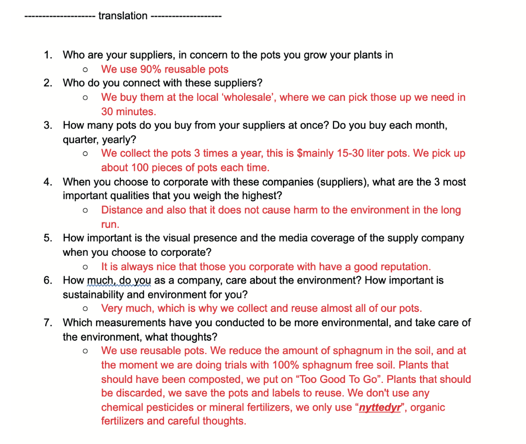
Interview As Repot mentioned, their first priority is to make an influence on B2B customers, so we reached out to them with questions related to their Business Partners. We wanted to know some details about production costs, expenses and companies they collaborate with, as well as revenue-expenses relation, what shows the financial stability of a business. We wanted to know what are the most important values that nurseries (B2B) are looking for, while creating tender for vendors, so also did research on the biggest nurseries in Denmark (as possible business partners for the RePot) and contacted them.
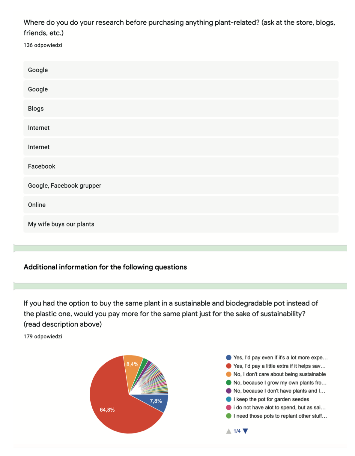
From this research we found out they are open to buy reusable pots, and reduce the ecological footprint, caused by transportation. This factor is on the top of their list when they consider Business Partnership. According to this feedback we intend to highlight that fact on Repot’s future website that they aspire to source the natural fiber and the eco-friendly glue locally.
Target group - B2C
Although RePot is not yet selling its pots directly to the clients, it is at the stage of creating a community and reaching recipients, which is why the B2C sector is very important for us in the project. Moreover, by promoting and trying to establish contact with the B2C sector, we make them aware of the existence of our products, which creates a demand for these pots, and thus the B2B sector gains direct consumers. To sum up, without reaching the B2C sector, there will be no need to acquire our pots by the B2B sector.
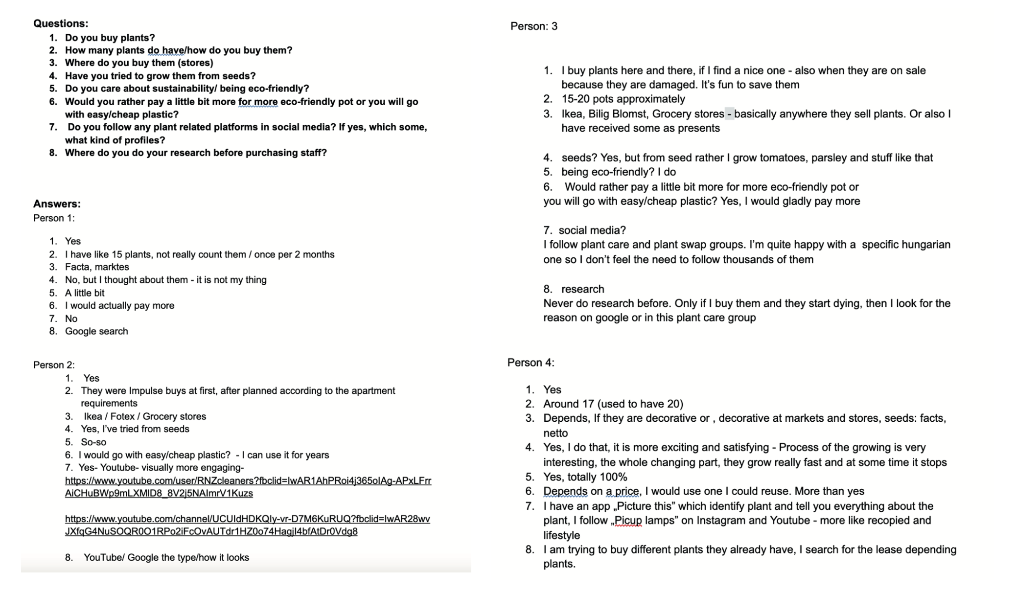
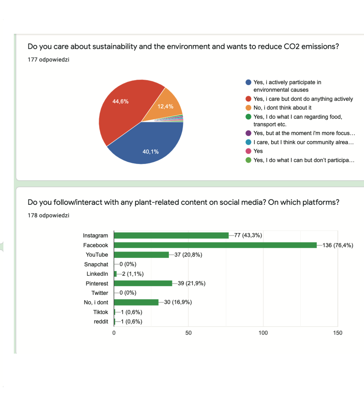
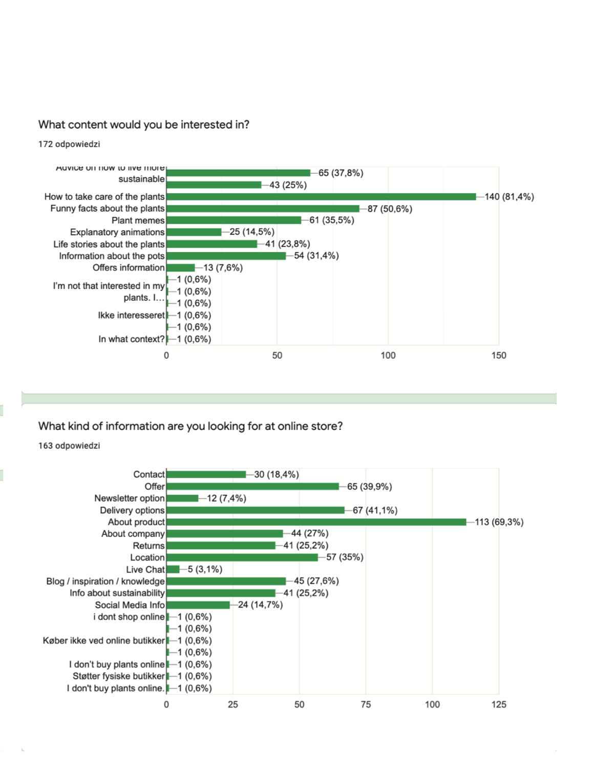
Interviews In order to get acquainted with consumers’ expectations in detail, we conducted different kinds of research. We started by interviewing 4 people. Due to the prevailing pandemic, we have limited ourselves to talking to the students at our school. Therefore, they were young people in a known, safe environment, so the atmosphere was friendly and students were feeling comfortable. The most important information we learned from the interviews is that plants are very popular and that young people more and more often decorate their homes with them. Another very important point was that those in charge of climate change action, and they would be willing to pay a little more for a product that they know contributes to the reduction of plastic waste and by that improving the quality of life on our planet.
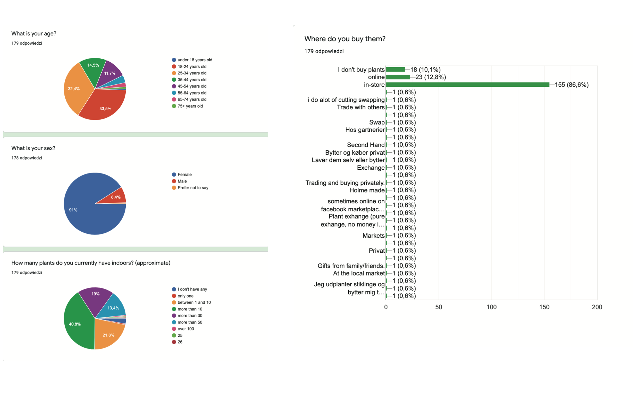
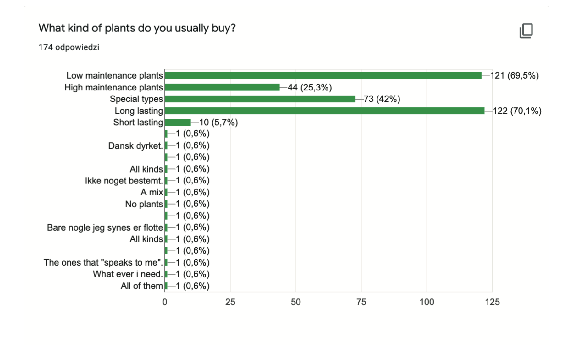
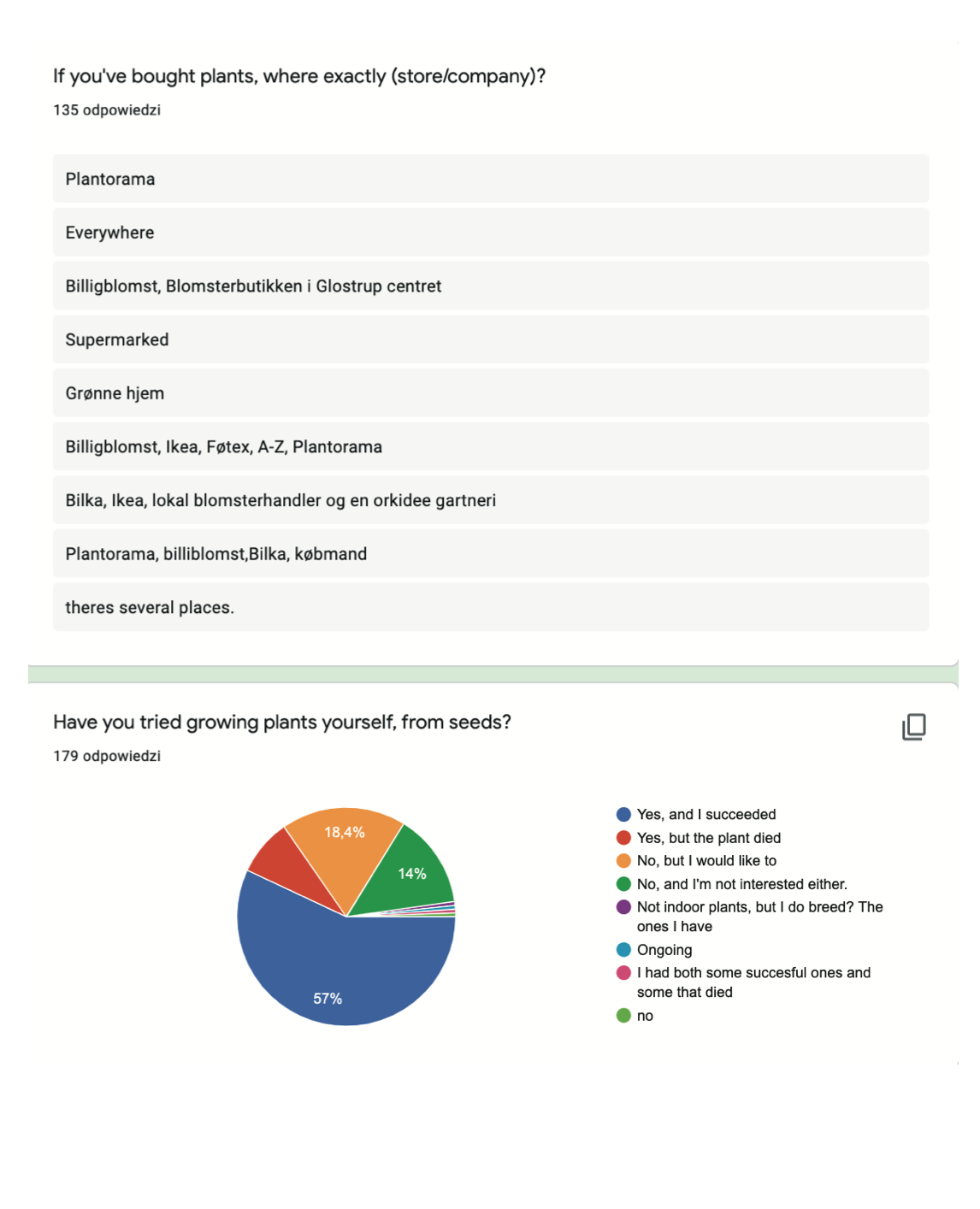
Survey Another important point was the survey, the response of which exceeded our expectations. Within one day, we received almost 200 responses. We gained insights from the answers that the average plant buyer is a young person and is usually female. These people have an average of 10-25 plants, willing to buy new ones or exchange for so-called plant swaps.
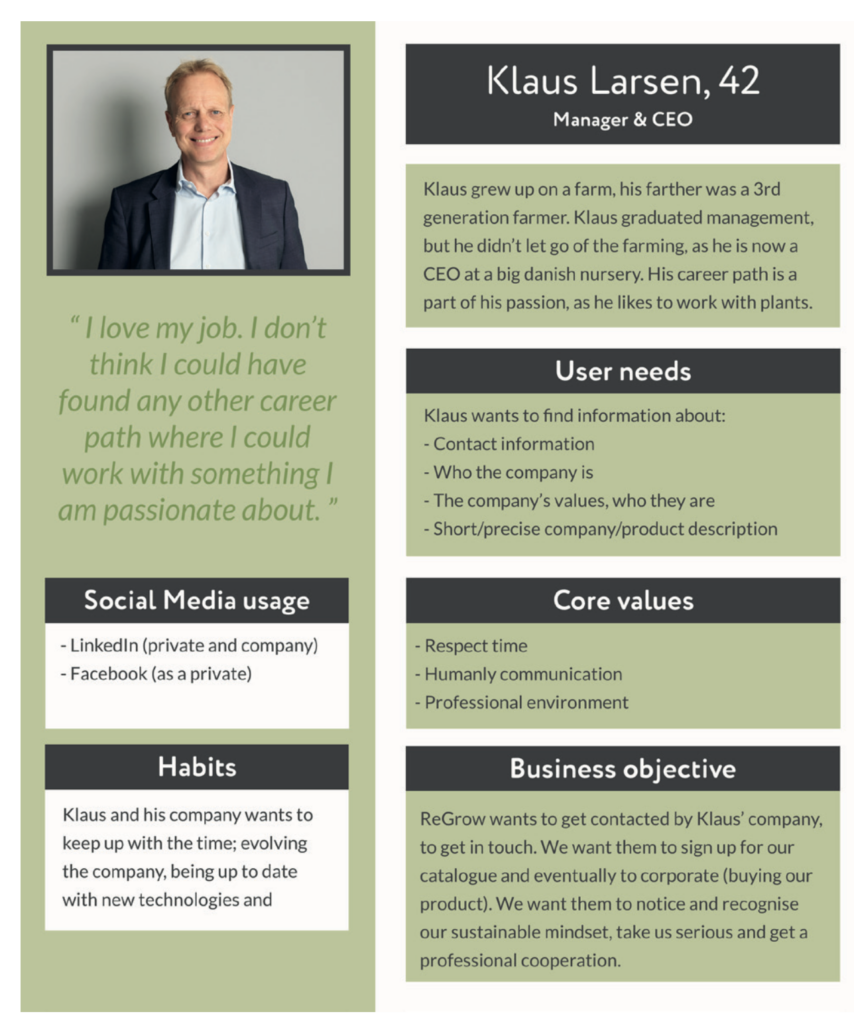
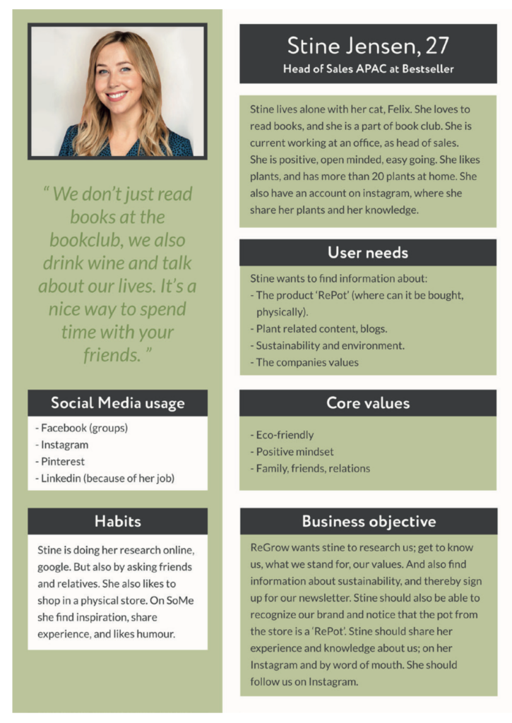
Personas The following two personas are representing the B2B (Klaus) and B2C (Stine) target group. Even if the B2C is the main focus of our solution, we will also take the B2B target group into consideration while preparing our digital solution.
Ideation
Coming up with a new name
We have analyzed Repot and established that the company should be informative and create awareness about environmental causes, and not just be a company that sells pots. Therefore the company needs a new name to be more separated from their product. By brainstorming, the group came up with six new possible names. The fundament of these names relies on the idea that it has more meanings. Whereas the word mate can be related to having a ‘friend’, ‘buddy’ or a ‘team-mate’. We also tried to stick with the word ‘Re’ as a short for ‘Recycling’ or ‘Reusing’, because it could relate the company with their existing product, the ‘Repot’.
To find the best fitted name, we decided to test these names on three people. We showed the testers a paper with all the six names on and asked them to explain what their first thoughts were and what kind of company it could be. For all names it was suggested that it was about sustainability, ecology, environment, recycling. We also had the opportunity to present these names for RePot founders, whereas the names ‘Re-mate’ and ‘ReGrow’ were received with a positive attitude.
The group hereby discussed the two options; Re-mate and ReGrow, and came to the conclusion of Re-grow as this had motivation and inspiration that fits to the fundamentals of the company’s values of creating awareness and sharing knowledge. It is also referring to the organizing idea “It is your time… to grow” and “Grow with us” as a community thought.
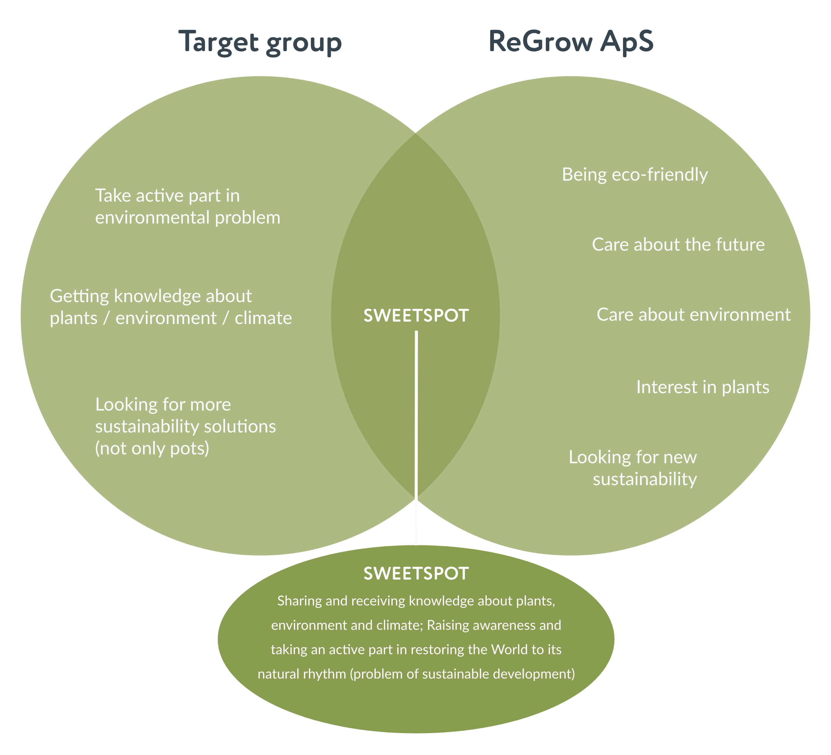
Sweet spot
To address customers as best as we can, and to fulfill their wishes to the maximum extent, finding a sweet spot is crucial. The interests of both the company and the customers are compared with each other to find where they meet. That meeting point is what we call a sweet spot, and it will define the majority of our solution in most of its aspects including design, content type and general user experience
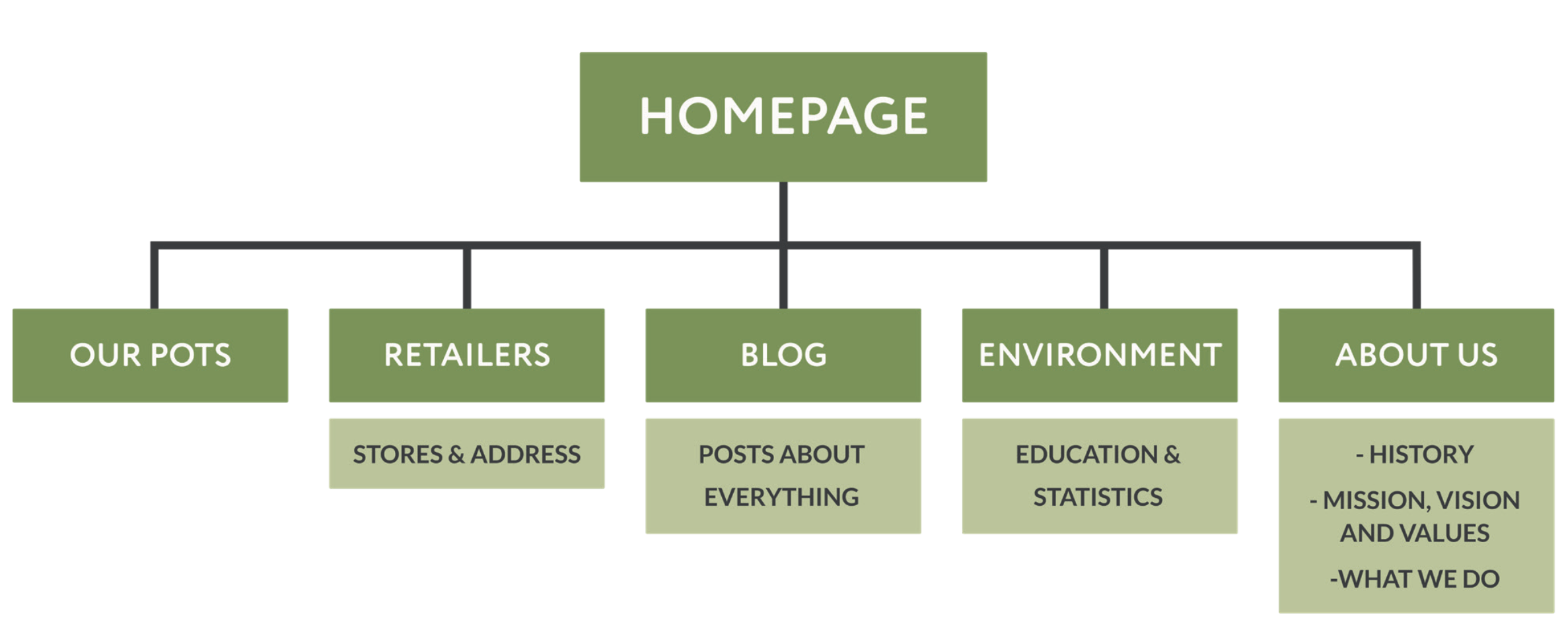
Solution and site map
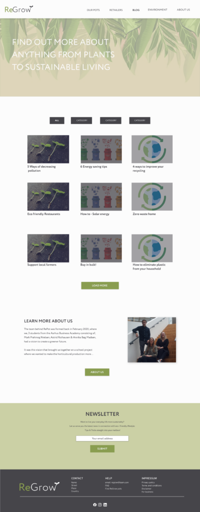
The client’s goal was not only to promote their pots, but also to create a conscious society that would stand together with them to fight for a better future. That is why we decided to create a website for them, which will not only present a product such as RePot, but also create a place to gain knowledge and inspiration. A website that will present a vision of a better world. By presenting scientific data, ReGrow wants to educate people and give tips on how even the smallest changes can have a positive impact on sustainable development.
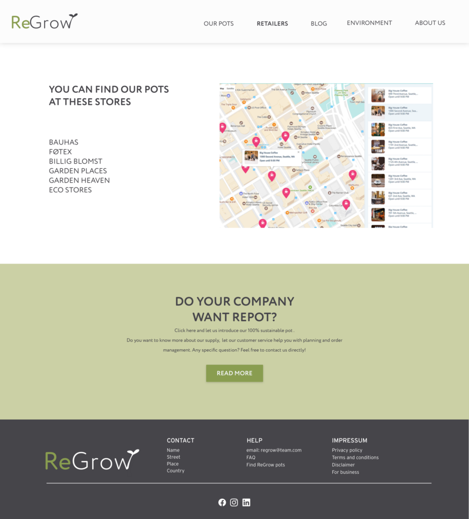
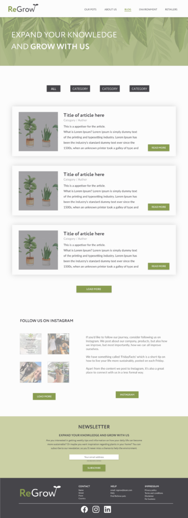
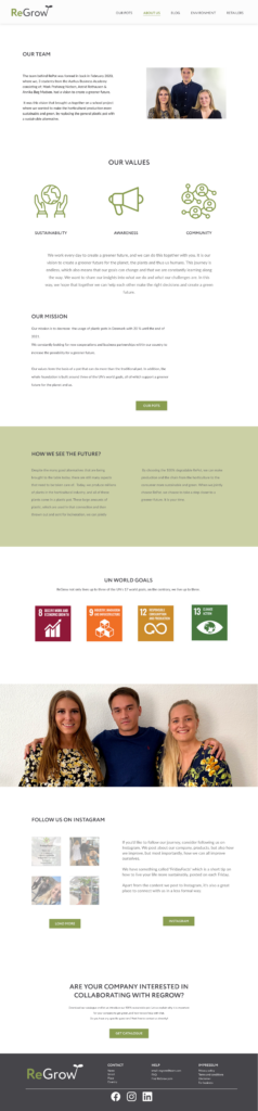
Based on our findings, we have created our final sitemap. It has five subpages. In order to further differentiate the company from the product, we separated the Our Pots page from About Us – the first is about the product, the second is about the company. The Environment subpage was created as well, because it’s an important part of the brand, and certainly deserves a separate page. Based on our research we have also created Blog and Retailers.
DESIGN
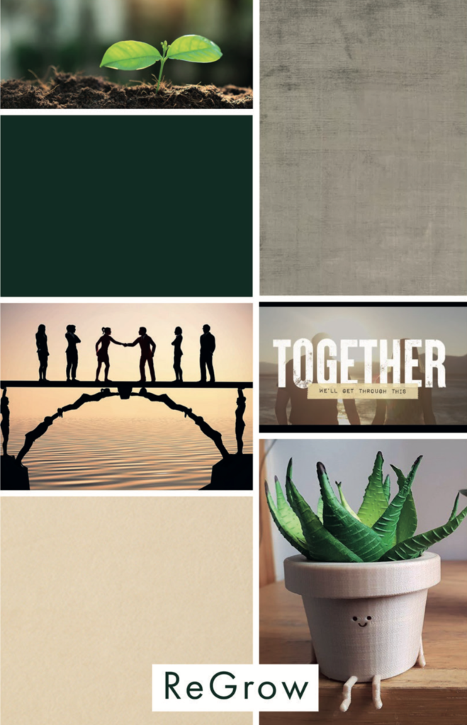
Moodboards
We conducted a moodboard brainstorming before creating the sketches, to check in which direction we are going. Each of the team members presented their vision. As can be seen in the presented graphics, we identify Repot with earth colors, subdued browns and natural greenery. In addition, natural textures, such as cracked earth, ropes and rocks. We wanted to show naturalness, hope and the need for solidarity. That was our idea for a visual representation of ReGrow.
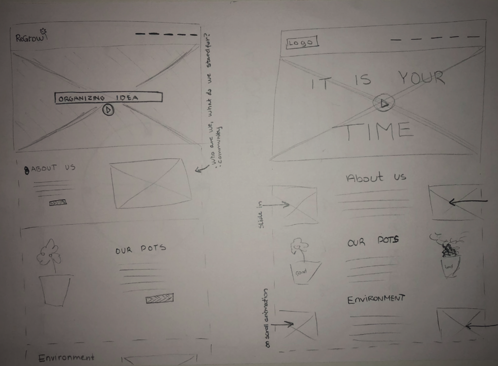
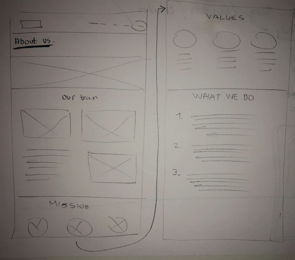
Sketches
When we started sketching, our main goal was to structure our content in the best possible way. On our navigation bar, we have the logo on the left side to follow conventions, it’s also a link to the homepage. For easier access, the navigation is on the right. We wanted to use a video on the homepage as a ‘hook’ to grab attention and make the user stay longer. Below that, we have a short section of each subpage containing a bundle of a picture, a description and a button that leads the user to the given subpage.
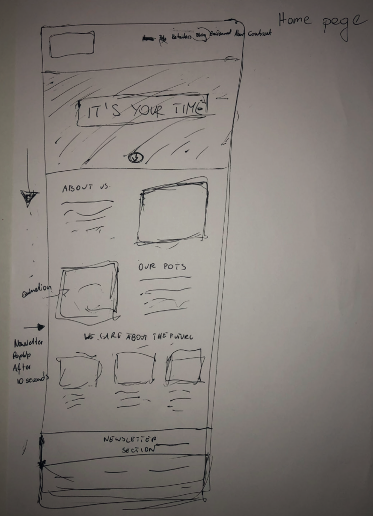
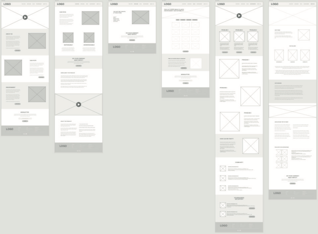
Wireframes
After sketching, wireframing is the next step in connection to create a design for a website. We used Adobe XD for this process, because that made the ideation and collaboration easier. During this procedure, we recreated and customized the hand-drawn sketches into vector format. At first, we defined the characteristics of the interface like what needed to show and how to set up navigation to help the user to flow from and to subpages without any problems. We tried to keep the navigation bar as minimalistic and understandable as we can, and aligned our logo to the top left corner, as users usually start to scan the webpage from here, which means that they spend more time on the logo. This helps to memorize and recall the brand easier. To create all of the above-mentioned elements in the right way we used the requirements of our persona.
Styletile
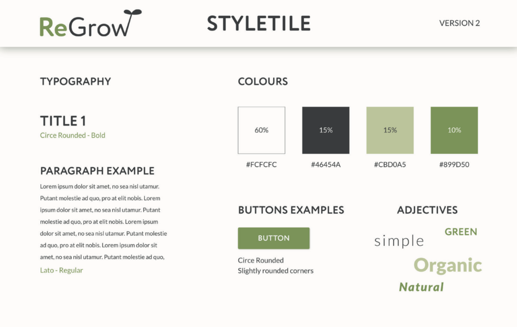
The typography for headlines are the same as the logo ‘Circe Rounded’, for keeping consistency, whereas the body font is ‘Lato’ that has a harder edge for making contrast. Formerly the body text used was ‘Circe’, but we decided to stick to the classical Lato.
For the color scheme we have used a 60% – 30% – 10% ratio. The background color is a soft white, to keep the website overall simple and clean. Whereas the soft green color also is used as background color for splitting sections and drawing more attention. The saturated black/dark grey is for text. Finally the vibrant green color is the accent color used for awareness and empathizing website elements. The colors are easy on the eyes, it’s soft to look at, but there is still a contrast.
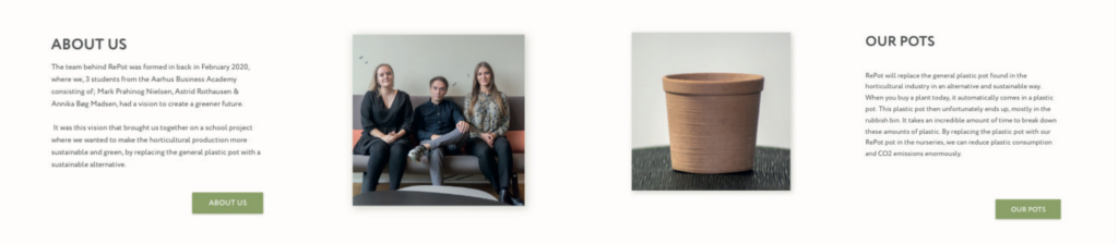
Mockups ver.1
After we designed the wireframes of the website, we moved forward to the mockup creation. We used our style tile and mood board as a base to implement the final visual identity. We implemented colors from the style tile in the mockups to reach a naturalistic yet modern outcome. We also wanted to apply some of the gestalt principles to create a satisfying visual perception. As you can see below, the text and the image are in line and fit into the same shape and by that seen as identical. Hereby we have “Similarity”. We used white-space on our page to avoid distraction and to let the user focus on the content without the feeling of congestion.
USABILITY TESTING
Testing
Due to COVID-19, this wasn’t as easy as usual. Our test subjects were either volunteers from our close proximity, and the testing was done online. However, we paid close attention not to test on close friends and family in order to make the testing as unbiased as possible. Instead, we chose testers for each other, which guaranteed that there is no personal relation to anyone we test on. We have tested our mockups’ functional prototype as hi-fi testing. During the process, testers were given tasks and questions. They used the prototype to carry out these tasks and they gave their opinions in the meantime. The questions were to help guide their attention to things we were curious about, this way they gave their opinions on the aspects that we think needs feedback the most.
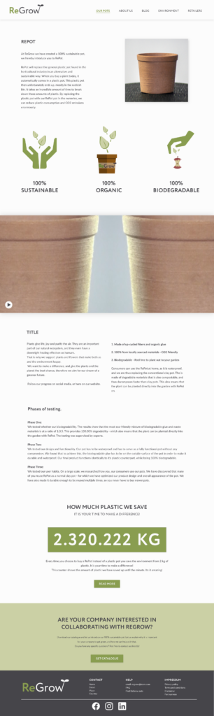
Based on our testing results we have changed a few things on our design. First off, the order of menu items on the navigation bar was changed, because some had a hard time finding information about the company and the comapny is very relevant. As the social media icons were found to be hard to find, we put more emphasis on SoMe by including it in the Blog subpage and also added bigger icons in the footer. The UN Goals were also moved to a new location upon further analysis, and we added a counter that counts how much plastic is saved by using RePots instead of traditional pots.
Project learnings
It was a very interesting project, where one of the main difficulties was to create a solution targeted at both the B2B and B2C sectors. With these two target groups in mind, we tried to find the most optimal solution for each group. In addition, the introduction and highlighting of a recently very popular topic, which is sustainable development, gave us the opportunity to test various forms of content for the needs of the website. ReGrow may be a fairly new company, but it certainly has great potential and a message that is extremely important to the world. During this project, we focused on issues that will help this startup in the initial phase of the company’s development. We managed to achieve this by creating an unique website and content which speaks to people’s emotions.