Set The Label Project
PROJECT OVERVIEW
Set The Label is a company founded in 2020 that was at the time in the start-up phase and has emerged from a dedicated school project that shows great potential. Their goal is to offer a collection consisting of 3 sets of clothes that fit together perfectly and can also be combined with each other. Beyond this, they are strongly committed to building a community of women where their company values and beliefs are shared. For Set the Label, it is important to open a dialogue with their customers and to support women so that they feel appreciated and inspired to embrace their true selves according to the principle “Fit in by being authentic”.
Project type: Group project
My Role: Company Analysis, UX Researcher, Wireframes, UI/UX Designer, Usability Testing
Project Duration: 5 weeks
Methodology: Agile Waterfall
Used Tools: Ai, Ps, Adobe XD, Visual Studio Code
Team members: Chiara Schäfer, Katarzyna Laniecka, Weronika Kiljańczyk, Sylwia Misiak
Problem definition: How can we help Set the Label to build up a unique community, establish itself as a strong clothing brand and thus create the basis for a visible and distinctive online presence to reach its target audience?
- What is the main value proposition of Set the Label and what products/services are they offering?
- What makes them special for their target group and how can they best communicate with them?
- What do they want to convey to their audience through their visual identity?
- How can they best build a strong bond with their target group?
Project Goals
1. Create Digital Solution for Set The Label.
Nowadays, online presence is almost obligatory, which is why it was our first and main goal of the project. We wanted to reach our target group in the best possible way and creating a website seemed to be the best first step.
2. Create Visual Aspects of the new brand.
To function properly, the company must develop its own identity based on a unique design. The visual identity is basically the story of a company and the values that it wishes to convey. It is one of the fundamental pillars of the communication strategy of any organization. Fact that the start-up has just been established and is starting its presence in the industry, created the perfect moment for us to give it a visual character that make the company stand out from the rest.
3. Create Online Community.
The main goal and value for Set The Label is to create a place that connects all women. Our client from the very beginning tried to show how important the issue of women and femininity is for him. Therefore, it was obvious to us that we cannot create just an online store, but also a kind of community for women.
Design Process
Research
Company and target group analysis. Gain user insights and understand the challenge.
Ideation
Deciding on content, sitemap, creating sketches.
Design
Creating moodboard, styletile, wireframes, mockups and prototype.
Testing
Get user feedback and draw conclusions.
Development
Developing website using HTML and CSS languages.
Research
Company analysis
Desk research
The first piece of information we got our hands on was the description of potential clients on Canvas. We learnt that Set The Label was a company selling small collections of matching clothing sets that focuses on quality, comfort and basic design. In order to prepare ourselves for the next steps, we started searching online. The only 2 platforms we could see their presence were Instagram and TikTok, however based on the small amount of posts we could tell they were a young brand.
Next we began researching the market. We found that the largest segment in the fashion market in Denmark is women’s apparel with a market volume of $2,5m in 2020, which is expected to grow annually by 2.5%.1 Clothing is 3% of the entire consumer expenditure and the biggest danish fashion company holds market value of $8 billion.
Interview with founders
During the course of our project, we maintained close contact with our client and valued their cooperation and openness to provide us with all kinds of relevant information. In this context, a specific interview helped us gain valuable insights, the most important of which we will highlight in the following.
The idea to found the company was born from the problems that they themselves faced time and again in their daily lives. The permanent struggle to find the perfect outfit every morning and the valuable time it takes was the reason for them to look for a solution.
They clearly see the brand’s unique selling point in the exclusive position as the only supplier of clothing sets. Their valuable network within the fashion industry enables them to accurately assess the demands of the market and position themselves as a unique new brand. Furthermore, they have close ties to a production company.
The sets are to be offered in a medium price range, which on the one hand most people can afford and on the other hand values the high quality and durability of the products. As the three most important adjectives they associate with their company, they mentioned: easy, smooth and high-quality. Lastly, they indicated that a website would solve their problem of not yet having an online shop where they could sell their products.
BMC
Based on information from our client we prepared Business Model Canvas to have overview on all fundamental elements of their business and better understand it. We started with Customer Segment, by dividing company’s target group into 3 groups based on their age/stage of life and their nationality. From that we moved to part about customer relationship. Our client highlighted during interview that they want to be in contact with customer and have trustworthy and transparent relationship with them. Even though it’s a clothes brand and most of the money they spend on is connected to the clothes industry, their key activities aren’t only selling clothes. They want also, by creating community share important for them matters. Having everything in one place, we understand in what area we can work on and what is essential for the company.

SWOT and TOWS
Another effective method to evaluate company is to conduct a SWOT analysis. It is a planning process that helps company overcome challenges and determine what actions to pursue. After conducting an interview with the company, as well as BMC analysis, we were able to extract the following items for each of the four categories.
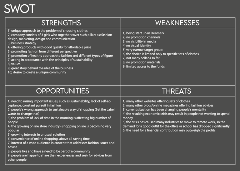
Our client interview was the main basis for showing strengths and weaknesses. To present opportunities and threats, a date obtained during desk research was necessary. Moving on to the TOWS analysis, we come to the point where the individual elements cross. Thanks to this operation we had wide picture about the company. In the graphic we pointed which statements were the most important for us while working on this project.

Target Group Research
Desk research
In order to now clearly define our target group, we started collecting data and further information. The most relevant ones will be examined in the following. Denmark has a population of around 5,8 million people, 50,2% of whom are women. Around 19% of the approximately 2.9 million women in Denmark are aged 20-34.
According to estimates, 97% of the population has access to the internet and a large number of over two thirds of them use it regularly for shopping. They spent 146 billion DKK online in 2019. The most popular goods to purchase online in Denmark are clothes. In addition, statistics Denmark states that “Four out of five Danes ages 16-74 has an active profile on social media.” When it comes to the purchase behavior of women, the social media specialists from adglow mention, that “Women are more emotional so it is advisable to offer products that appeal more to emotions”. They also state, that “women use social media to talk more about their personal life and post their personal experiences, opinions and stay in touch with family and friends.”
Survey analysis
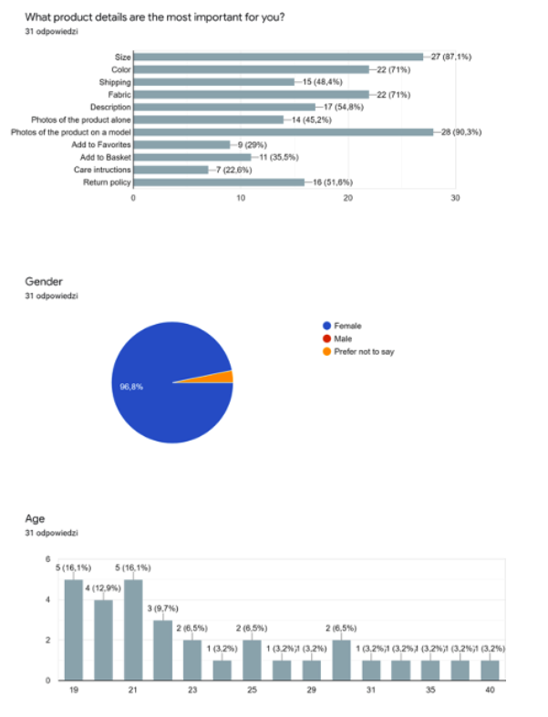
In order to provide our client with the best solution possible, it was crucial for us to find out how our target group thinks and behaves. We put together a series of questions and posted it on a Facebook group for internationals in Aarhus. Out of the 31 replies we received, the statistics we found the most helpful were:
- Our target group shops mostly on desktops and mobile phones, which showed us what versions of the website we should focus on.
- They value information about the products such as size, photos on the model, color, fabric, return and shipping policy the most.
- Topics they would like to read about if we decided to create a blog to go with the online store.
Channels they would like to use to communicate with the brand.
Structured interviews
To get more detailed information we made interviews with people, who were representing our target group. To understand better what kind of content we could prepare, we asked about their opinion on the positive body image in fashion industry. The answers were that it doesn’t contribute to this kind of image. Our last question was about how the way of communication form website affects on staying with the brand. The ones, who answered that it matters for them, said that they prefer easy going relationship, rather than official one. This interview helped us better understand our target group and their needs regardless our digital solution. Questions we asked were:
1. How long does it take you to find your outfit for the day?
2. What are the most important criteria for you when choosing a fashion brand?
3. Are durability, quality, sustainability, the location of Production (“made in China”) and efficiency imortant factors for you when buying cloths?
4. How would you describe your daily outfits (colorful, simple, wild…)?
5. Do you have the perfect pants to match all your tops?
6. Do you sometimes have difficulties finding the right size?
7. What should be in a fashion newsletter for you to subsribe to it?
8. Do you have not enough or too many clothes?
9. Do you think the fashion industry and clothes contribute to a positive body image?
10. Do you like to keep up with every fashion trend?
11. Name three adjectives that are important for you when it comes to choosing a fashion brand.
12. What is your favourite clothing brand and why?
13. Do you shop online?
14. Do you follow fashion brands on Social Media Platforms? If so, which ones?
15. Does they way of communication from a company’s site affect whether you will stay with the brand or choose a different one?
Creating personas
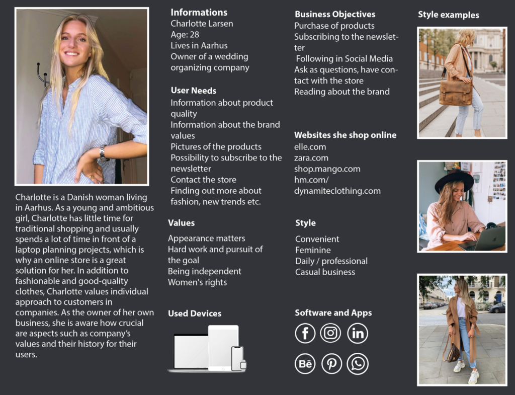
After collecting all the information received so far and analyzing it, we created two personas. When creating them, we took into account issues such as their values or user needs. Thanks to this, we were able to create the right content for our future solution. Issues such as their styles or websites, where they buy clothes, were helpful when creating visual parts of the project. In addition, we tried to answer the question what activities should be available for them when using the site. Information, which devices or applications they use has helped to create the most optimal digital solution that they would like to use. These personas were our main determinant when creating solution for the needs of this project.
Ideation
Brainstorming
We started our analysis of the problem with traditional brainstorming. We began with general topic connected to our client’s company and then we narrowed it to a more specific one. That’s why we started with fashion, as Set The Label is a clothing company. Next we moved to more detailed topic for our solution, online store/magazine. From this brainstorming we got to know what kind of information is possible for this kind of website. Our final brainstorming was about a possible solution. This way we gathered ideas for so many different things that we can do for our client, not only for first part of the project, but also as future development.
Mindmaps
For visualization of all thoughts that we gathered during brainstorming we did a mind map. We categorized all topics in a way that helped us structure information, so we could analyze it and add some new ideas.These mindmaps helped us decide on what kind of content we should focus on.
Sweetspot
Having quite a lot of knowledge about the company itself, their needs, the values they represent and what they want to achieve, as well as knowing the needs of the target group, we started to create the most appropriate solution for Set The Label. By analyzing all aspects, we managed to find Sweet Spot, which was the basis for us when creating the digital solution.
Card sorting and sitemap
Later on by analyzing the results of the research, we were able to create possible options for the structure of mentioned earlier digital solution. We have created categories that we considered necessary for the site and carried out the virtual open card sorting. After creating different sequences, the categories that we finally presented to a group of testers you can see on the right side. The results of the card sorting we have received were very different. After analyzing the needs of our target group and personas, we finally created first version of the sitemap. Considering the type of our solution, Shop and Community were necessary to include them over there. The Shop was to focus store materials, while the Community was to combine the blog and encourage sharing stories. In addition, taking into account founders’ involvement in brand building, we also included the About subpage. We also couldn’t miss categories such as Help and Contact.

Benefits for the client and the audience
In view of our client, we wanted our solution to meet their needs. Set The Label, as we mentioned before is a company that is going
to distribute their goods only online, so webshop is essential for them to do that. All parts that we decided to put on website are based on our research, in this way our client and the audience will have all necessary information accessible. By having community category our client will have an opportunity to stay in touch with their customers and create safety place for them, where they can share stories. Thanks to About category the company can gain trust from the audience, by showing that there are real people behind that. Also this category will benefit for personas, as they have a need to have information about the brand on the website.
Design
Moodboards
Now, we were able to move to more visual part of the project which is Design! We started by looking for inspiration from other websites dedicated to clothing stores. We noticed that all of them have pretty similar foundations. Light colors, simple menus, big pictures and lots of white space. However, there weren’t many websites that would combine a store with a blog so we knew we would have to come up with strategies and designs of our own as well.
Then we decided to prepare a few moodboards to know in which direction we want to go. Moodboards help a lot with any projects. They give a certain atmosphere and a specific design direction, not necessarily giving ready-made answers right away, it is more of a signpost that gives hints and gives the character of a new project. There were several moodboards, and I present my composition next to it. However, all ideas were characterized by positive images, soft colors that create a harmonious and gentle overall impression.

Sketches
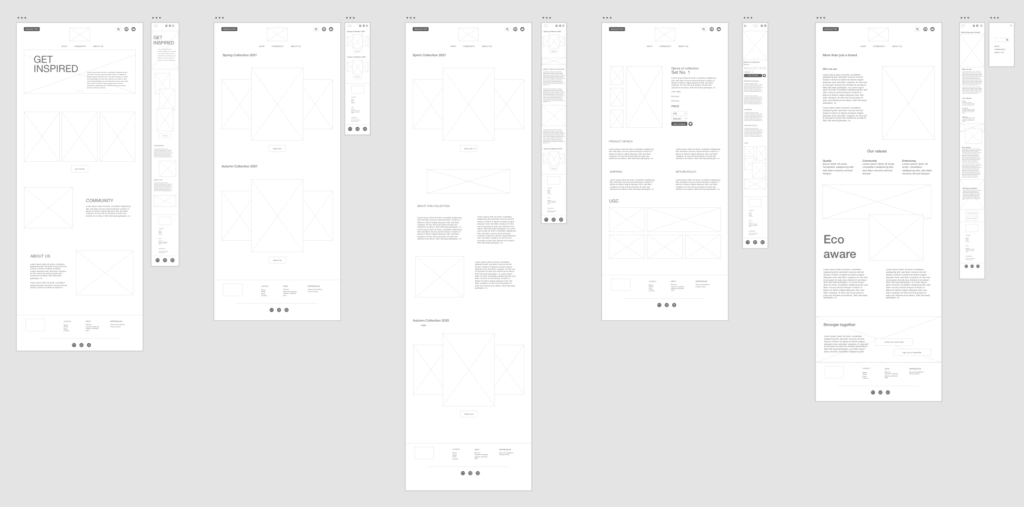
After analyzing different options we managed to find a way that seemed to us the most optimal. We decided to have a menu in the minimalistic version. It consists of 3 categories: Shop, Community and About. In this phase of the project, we decided to transfer Help and Contact to footer, where they are most often found. Also, in the top bar, we can find the newsletter button, logo, basket and account icons. Right under welcoming banner we have collections offered by the brand with a button pointing to the shop. Next we have short descriptions and links to the Community and About subpages. The whole is finished with the classic version of the footer.
Shop subpage shows clothes collections which direct us to the Product subpage. Here we have detailed information about the items. In addition, we can find here content created by the customers (UGC). Thanks to this, we create a bond between the brand and the clients.
The structure of the About and Community pages is very similar. Both kept in the classic version with short paragraphs and photos on the sides. On the first one we have sections devoted to the brand’s values and goals. Moving on to the Community, we have sections devoted to women’s community.

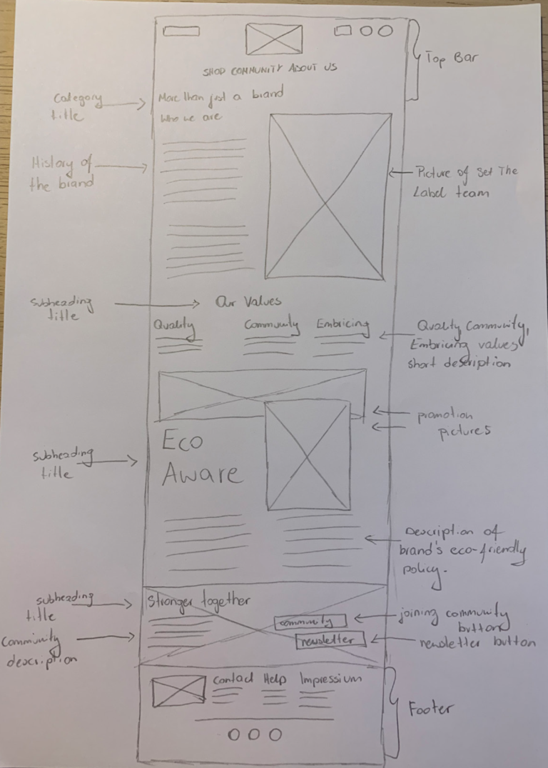

Wireframes
Having the skits ready, we also prepared them in digital way. In this part, we mainly worked on the size of individual elements, their arrangement and space on the page. The mobile version is very similar to the deskt version, but the difference is in the menu. In the smartphone version, we decided to use a classic burger menu, thanks to which we gain space, which makes the appearance more aesthetic.
Style tile
It is true that the moodboards we create reflect the character we want to present on the website, but for the project we also created a style, which was our reliable cheat sheet when creating mockups later in the project. We presented the most important colors, fonts, as well as possible icons or adjectives reflecting the nature of the page.
It is worth noting here that Set The Label already had its logo and base colors at the start of the project. This combination was the basis for our further design. The font we chose to use on the site is Lemon Milk. A seemingly simple font, which, however, perfectly reflects the nature of the website and also refers to the broadly understood world of fashion.
Throughout the project, we wanted to focus on minimalism, straight lines and avoid unnecessary additions in the case of buttons or icons.

Mockups
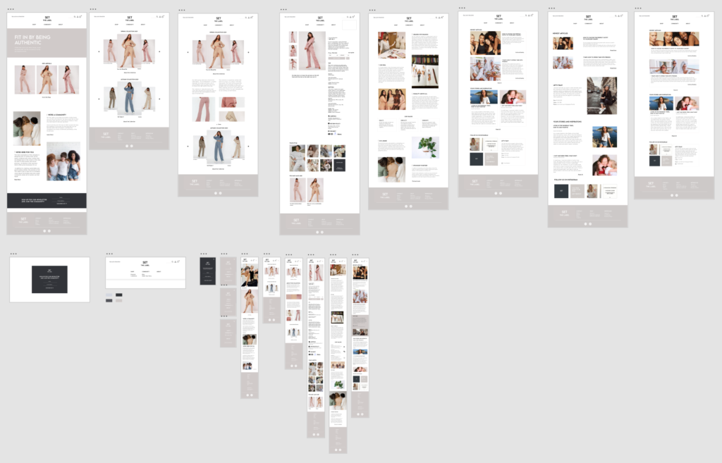
At this point we had a strong base. Now we had to take care of the details that make a big part of the user experience and are crucial in creating visual identity of the brand. We decided to add an option to subscribe to the Newsletter, which is nowadays very useful in maintaining good communication with the client. In the pop-up itself we decided to include not only email, but also name of the user to create a connection with personalized messages. We chose a dark background color from our color palette, to make it stand out from the rest of the page when it shows up.
The next element that can be found on every page is the footer. Also kept in a minimalist tone, with delicate icons and company logo. The first version was light in color, but in the final version, after usability tests, we decided to change the color to a darker one.

Another very distinctive feature of the page are the small beige rectangles that are visible next to each title. Thanks to this, we wanted to give character to the website while maintaining a very minimalist style. It is also worth highlighting the photos that are supposed to give a sense of belonging, warmth or kindness.
On the About Us website, we decided to highlight the company’s values. We believe that it is crucial for companies to be able to name them and follow them, so we have placed them in separate frames to attract the attention of recipients.

Testing
Usability testing 1
After creating the initial vision of the website, we conducted usability tests to check if the website is user-friendly, what we still need to work on and what changes should be made to the project before we start coding. It was very important for us to find out how users interact with the website, if they have any difficulties and what their overall impression is.
TEST 1
Situation: You are a young woman looking for some comfortable clothes for your everyday life. You are also interested in finding a community to gather with other women, read articles, stories and find some more inspiration. You found the website of „Set the Label”. Please complete the following tasks and answer the questions:
Task 1: You want to get more information about one single product. Go to the Product page.
1. Is product information easily accessible? Do you miss anything?
2. Is the way the product is shown right for you or would you change
something?
3. What do you think “Your style” on the product page is?
4. Is the information shown on the collection page relevant to you?
5. Where can you find delivery, shipping and return information?
Task 2: You are interested in being part of the community.
6. What do you think the community is about?
7. When will Instagram Live with Naomi take place?
Task 3: Go to “About Us” subpage.
8. Is information about the company easily accessible?
9. What are the three values of the company?
General questions about site:
10. Is navigation on the site easy and intuitive?
11. What are the adjectives you can associate with Set The Label site?12. What are your thoughts on the design and layout?
13. Would you add/change something on the page? Is there anything you dislike?
Examples of the answers:
1. Is product information easily accessible? Do you miss anything?
1. I couldn’t find product subpage, only the collection one was working for me. I really like it, very simple and accesible. I kinda wanted more practical information separated, so I don’t need to go trough all that description to find it (for example a box with available sizes, prices, material, how to take care of it, on what degrees to wash it etc.)
2. On phone site is very small, but in general site is very clear and easy to read.
3. Yes, the site is clear and there are most important information.
4. Yes, it’s easy to find and access
5. I like all the information about the product, really nice. A bit empty on the left side
6. couldn’t find product page
7. yes it is, short, brief, obvious
12. What are your thoughts on the design and layout?
1. Really nice layout, i really liked how you combined the text with the images.
2. It’s ok, I like it
3. Beautiful and clear
4. I really like the layout and how e.g. ‘about’ or ‘community’ sections look like. The
design is very, very simple. I would even say, too simple.
5. whitespace on product page too much, really nice design, looks professional, looks
like it’s already out there
6. makes me feel at home, wanna read it, learn more about it, its honest, they do
what they really like, like the layout, like the colors, like the whitespace, footer text
could stand out more, maybe more bright or a hover effect, like the design
7. really like the design, everything matches, fashionable, clear, minimalistic, really
like the alignment of the page
Outcome
The testers described most parts of the website as clear and easy to use. However, the footer was mentioned to be lacking in contrast. Concerning their perception of the overall design and adjectives they associate with the website, they mentioned: modern, catchy, simple, trustworthy, minimalistic, clear, elegant, warm, feminine, fresh, soft, nice, easy, natural, organic, pure, harmonious, stylish, honest, fashionable, professional and welcoming.
Due to some unfortunate flaws in the connection of individual screens with each other the product page was difficult or even impossible to find. We then completely revised the structure and limited ourselves to a single menu point called „Shop” which we based on web-shops of other successful clothing brands. Furthermore, we moved the carousel presenting the products to the main page, while modifying the product section to a classical display of images placed side by side.
Finally, to overcome the lack of contrast we designed various alternatives for the footer. In doing so, we decided to conduct a second test where we compared two possible options.

Usability testing 2
After first usability testing we were not sure about the colours, newsletter and the UGC. That’s why we decided to do the second round of testing by adding some new questions. The feedback about design was very positive, the navigation was described as simple and user friendly. We also gave our testers options to choose between two different colours of footer, but opinions were divided. The one, who was in favour of darker one spoke to us more. The reason behind this choice was that “it’s better to read, more visible, fits better to the website”. We decided on darker one, because this way we had better contrast and that’s needed on our website. To make sure that these elements are understandable and on the right place, we asked about the section with the headline #SETTHELABEL and the newsletter. For our testers it was easy to understand what the mentioned sections are about and to sign up for our newsletter.
There were few changes that have been suggested: option to see small pictures in a bigger version, some alignments and bigger font of the price. We applied all of them to our mockups. At this point we had also a feedback session with our client. The general message was positive, our client was fond of our interactive prototype.

Development
Performance tests
This project was definitely one of the biggest projects I had the pleasure to participate in. Working in a strong team, in which everyone could boast of different skills, taught me, above all, cooperation, that communication is one of the most powerful tools. An in-depth analysis of both the company and the target group significantly helped in designing an appropriate digital solution. Conducting usubility tests already in the prototype phase helped a lot in improving user flow and design.
SEO
Implementing SEO can help position a website high which is crucial to attract traffic. During creating our solution, we made sure that have all the necessarytags, properly signed graphics, headlines or paragraphs. In addition to our audits, we also have checked code using Markup Validation to fix possible errors. Thanks to these and other improvements, we increased technical performance of our digital solution.
Project learnings
This project was definitely one of the biggest projects I had the pleasure to participate in. Working in a strong team, in which everyone could boast of different skills, taught me, above all, cooperation, that communication is one of the most powerful tools. An in-depth analysis of both the company and the target group significantly helped in designing an appropriate digital solution. Conducting usubility tests already in the prototype phase helped a lot in improving user flow and design.
Improvements
Since the company has never had a website or such before and is still in its early stages, plenty of additional features can be built up on the foundation we created so far.
- A first step would be to complement the web-shop using e.g. shopify. Possible payment methods, such as VISA or Klarna, need to be added and the company’s supply chain connected. In addition, the option to create a personal account and adding products to the shopping basket are yet to be set up.
- As far as the newsletter is concerned, a general layout needs to be created and, if necessary, guidelines to be defined. In the field of content creation, an editorial plan is to be drafted, which will schedule the regular dispatch.
- Since the team of Set the Label itself currently does not have the adequate expertise and possibilities to handle HTML, CSS and JavaScript, a transformation of the code to WordPress is conceivable to allow an easier handling and implementation of upcoming changes.
Summing it all up, we can state that there is a lot to consider and implement when building a new brand. With our project, we achieved to develop a strong foundation for the digital appearance of Set the Label and thus paved a part of the way for a successful entry into the fashion market.


