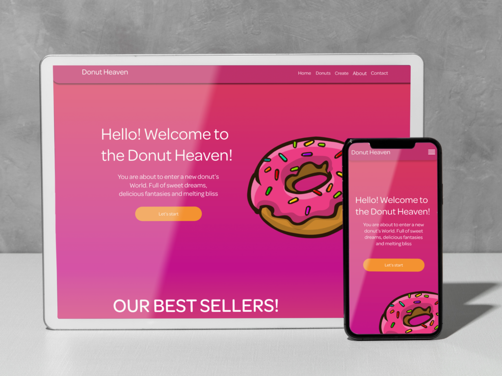
Donut Website Design
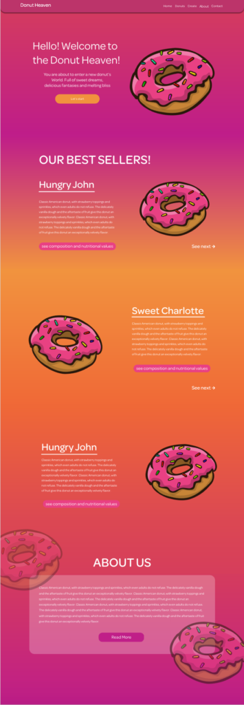
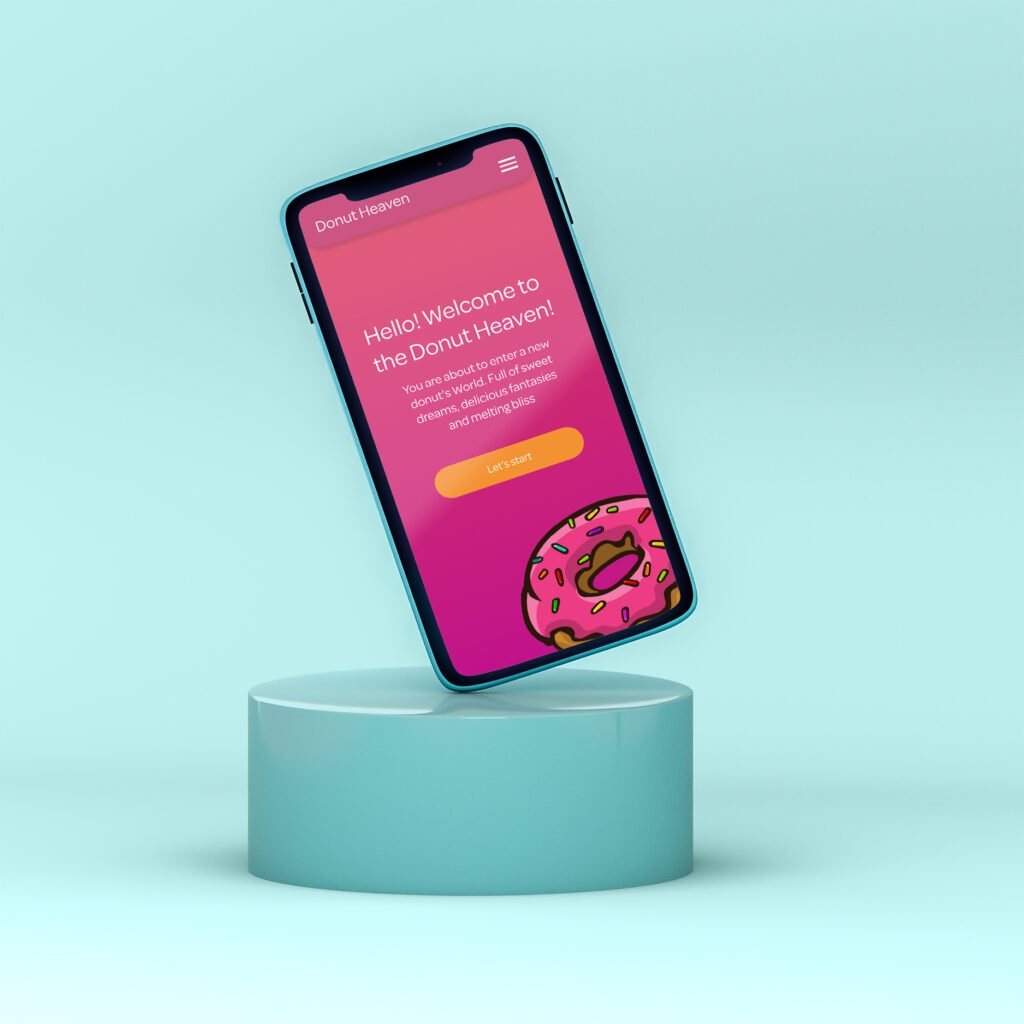
The Donut website was created as part of the skill exercise in Adobe Xd. In this project, I focused primarily on animations that can be created in the program, increasing the user experience. In addition, I wanted to test myself in a slightly different design, more colorful, rounded, still minimalist, but with a slightly fairy-tale character. A topic taken from life, because who doesn’t love donuts? 🙂
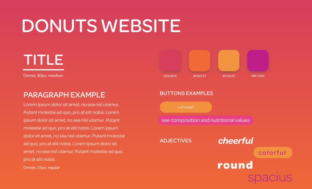
The whole design is kept in gradient colors, which are very popular lately. Such a combination perfectly emphasizes the colorfulness of the donuts, which often attract attention with their diversity. The buttons are rounded, thanks to which they refer to the round shapes of donuts. Supported by animation on hover, they attract attention and have a positive effect on the user experience. The font used in the project is Omnes. A very minimalistic cut, which, however, is characterized by slight curves, another reference to the sweet heroes of the website. The whole design is characterized by a lot of white space, thanks to which the user focuses only on individual elements of the page and is not distracted by other features or content.
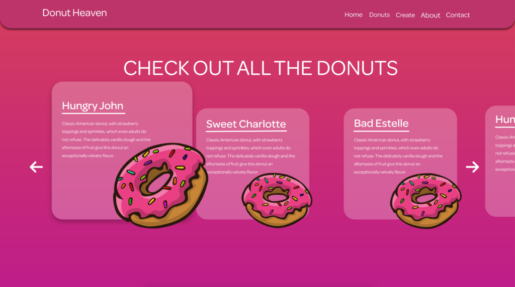
As I mentioned at the beginning, in the project I focused on the use of animations, which we can see when hovering over the buttons, but also on the Donuts page, where we have a carousel showing individual donuts, which, when hovering over them, increase, while after clicking, a popup appears with detailed information on product theme.
